Cookie-Cutter Photoshop Tutorials
- By Matt Stephens
- June 17, 2006

Every programmer secretly wants to be a great graphics designer. (Or is that just me?) Unfortunately, programming talent and visual design skills rarely go together. This is why so many early UIs were such monstrosities, as programmers were required to turn their excellent aesthetic senses to the delicate task of user interface design.
To witness the result, we need look no further than the Swing “bright shock of purple” default color scheme that was only turned into a less distressing ocean blue after about a decade of burning itself onto those poor, long-suffering end-users' retinas. (And let’s not mention the default bold style and horrible Lucida font!).
So it’s good for us programmers to occasionally try out something like these Photoshop tutorials, partly in the hope that we might pick up one or two good habits for our UI or web designs; but also (sadly) to remind ourselves where our skills truly lie.
The “cookie-cutter” tutorial is often derided by graphics professionals, who believe that creativity should well up from a deeper appreciation of art backed by years of Photoshop doodling; and not by a 12-step guide to drawing a fractal mountain (complete with lens flare effect). But hey, for the rest of us a quick vacation in “Photoshop-world” can be fun; and these quick tutorials are just the ticket.
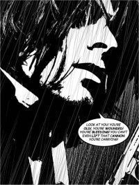
This one’s especially good: How to get that Sin City look. And not a hint of purple in sight.