The Silent Cat Strikes Back
- By Matt Stephens
- February 20, 2006

A few days ago I wondered why software can't be naturally pedagogical - that is, why can't it just naturally teach you how to use it, as you use it?
The answer, of course, is that software generally should try to teach you, because people do not separate learning from doing. Instead, users tend to learn as they go along: exploring the UI, experimenting, trying to work out how to print by clicking things with the mouse.
So why doesn't more software take this into account, and take the "silent cat" approach to teaching the user while they're using the software?
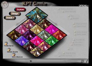
Here's a blast from the past: KPT Convolver (see the screenshot) was a great example of this principle done right - and done right, over 10 years ago! It didn't shove a tutorial down your throat while you were trying to get some work done; instead, it quite subtly revealed new features to you when it felt that you were ready for them.
While the product was rather experimental, it also seemed to uncannily know how much "new" functionality to reveal to you. This approach also encouraged you to experiment with any new feature that had just been revealed - the best way to learn by far. So, Convolver provided a natural progression path from beginner through to advanced, without your ever having to resort to reading the manual.
But in order to say less, and therefore make the user fill in the cognitive gaps, your product must have something to say in the first place: and this is why most software already "does the silent cat" (so to speak), but catastrophically so - the result being a UI which is difficult to learn.
So, to make software inherently learnable, you can't just apply a "quick fix" to an existing UI. You'd need to approach the whole design on the basis that you want the UI to teach the user as they go along. Once the software actually has something to say, and is saying it, then you can start to cut things back - selectively, intelligently - making sure that you never actually make the software impossible to learn or use.

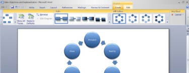
In a way, Office 12 takes this approach, with its "task-based" contextual command tabs. To perform tasks like inserting page numbers, headers and footers, you simply choose them from an available gallery - in other words, the software is telling you pictorially how to use it, while you use it.
It'll be interesting to see if Office (and other Vista apps as they start to become available) errs towards "saying too much" in its UI, and ends up being more intrusive than helpful.
So, just where is the magic line between too much pedagogy in a UI and too little information for the poor user who's just trying to get some work done? At the risk of "copping out" just as I've got to the real billion-dollar question... that's way too complex to answer here. Someone really should write a book about it...