The 'Pizza Flyer' Approach to UI Design
- By Matt Stephens
- December 21, 2005

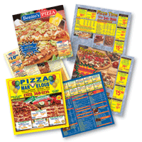
This article by Jonathan Baldwin is a good thought-piece about the way in which pizza flyers’ bold, punchy design – though an assault on good taste – sets expectations appropriately. It raises the question, are pizza flyers examples of good graphic design?
From the article:
"But would a ‘well designed’ pizza flyer work? Isn’t it probable that some modernist, sparsely filled masterpiece would send out the signal not that you can have a cheap pizza in minutes, but that you were being offered an expensive and minimalist piece of nouvelle cuisine? The fact is, pizza flyers set up precisely the right expectations about the product and the service: cheap, cheerful and quick."
The article made me think about pizza, which made me hungry. But it also made me think about software UI design, and about how the interfaces of the products we create set the user’s expectations.
Software MP3 players, for example, tend to use non-native widgets; and they tend to be all curvy, eschewing any sense of conformance with the desktop in which they are forced to sit. Load up your copy of Winamp and expect to be a non-conformist, radical teenage kick-ass rebel. Or something along those lines.
But some software design principles actually work in the opposite way.
In particular, a complex UI doesn’t have to mean powerful software; and, conversely, powerful software doesn’t have to mean a complex UI.
Word processing applications tend to look rather formidable because they pile all of their functionality into multi-level toolbars. But on the other hand, a hugely powerful software product with hundreds of functions could give the impression of being very simple and straightforward to use by only offering the core functionality at the “top”; e.g.: Google's home page.
Which reminds me, I must Google for a local pizza delivery firm...