The World is Put to Rights: NetBeans *finally* has a Usable Options Dialog
- By Matt Stephens
- October 14, 2005
In its early days, NetBeans’ UI was something of an eyesore. Even the most grizzled, pragmatic of programmers cringed at the giant space-hogging panels or the bright purple background which leapt out at them any time they minimized an editor window.
However, more recently, the UI has become one of the main driving forces behind NetBeans’ renaissance. Piece by piece, the UI has been improved, until the product today is barely recognizable from the NetBeans of a few years ago.
It’s been rather like redecorating a mansion, room by room: a mammoth task, and bringing one room up-to-date makes the older, dilapidated, old-fashioned rooms really stand out by comparison.
One of the last rooms in the NetBeans mansion to be updated is the horrendous Options dialog. It was high on my list of much-needed improvements when I did a UI review of the IDE a year or so back. One word to describe the options dialog would be “generic”. It lacked layout, design, thought, consideration of how users would want to access their options. Obscure settings were given equal consideration to the more important ones, resulting in a cluttered, even confusing mess of high and low-level, system and application-level settings.
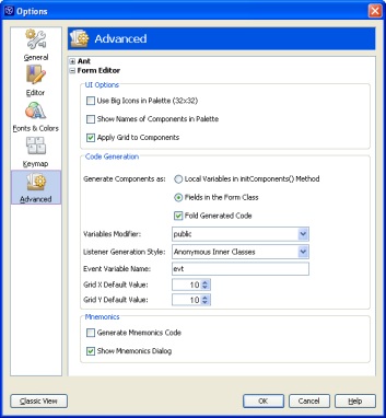
Now, finally, thankfully, the dialog is being replaced with something which is much more, well, how can I put it, designed:

(Screenshot from NetBeans 5 Beta).
It’s actually quite reminiscent of the FireFox options dialog – remarkably similar, in fact! But that’s definitely a good thing, as the FF dialog is a thing of beauty: Minimal, clear, nicely laid out, and with tastefully-colored boxes to help group related settings.
There’s still much work to be done with the NetBeans dialog though (although the team is gathering feedback on what people want to see in the new options dialog), as an awful lot of “important” settings are missing. This means that, unfortunately, it’s still necessary to keep the old Options dialog side-by-side with the new one, so we’re not quite rid of the old monstrosity yet.
So there’s a serious case of dialog schizophrenia going on there currently. But there are plans to remove the old dialog, add some advanced options to the new one, and relegate any really obscure settings to command-line switches. Sounds like a good way to go.