News
Google Provides Mobile UX Tips
- By David Ramel
- March 14, 2016
Quick, test your mobile app intuition: As the developer of a real estate app, for example, that you want users to try, would you feature a front-and-center button that says:
- TRY IT NOW
or
- Rent Buy Sell
If you chose No. 1, Google's new Designing for Mobile Micro-Moments may be of special interest to you, as it's designed "to help app and mobile site developers learn what comprises a best-in-class mobile experience."
It's full of usability tips that inform you, for example, why choice No. 2 above is better: "The call to action, 'Try it now,' is vague and isn't geared toward action," while " 'Rent,' 'Buy,' and 'Sell' provide clear calls to action."
Google's call to action is to help Android developers provide better apps that make them more money while enriching the Web giant's coffers in the bargain.
To do that, it teamed up with AnswerLab to conduct research on the behavior of more than 100 users using an equal number of apps and mobile sites "to uncover what led to a seamless experience and what design experiences were problematic or caused frustration to users."
That research was boiled down to 25 guiding principles in the areas of: 25 Principles of Mobile App Design: Engage Users and Drive Conversions and 25 Principles of Mobile Retail Apps and Sites: Designing a Better Commerce Experience for Shoppers.
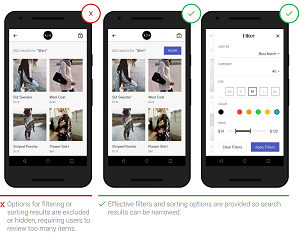
 [Click on image for larger view.]
Provide Filter and Sort Options (source: Google)
"Mobile has shaped the way users interact with businesses and brands alike," Google UX researcher Jenny Gove wrote in a blog post last Thursday. "Nowadays, businesses cannot simply replicate their desktop strategy on mobile; they need to re-think how to build mobile experiences that are useful for clients in their moments of need - those I-want-to-know, I-want-to-go, I-want-to-do, and I-want-to-buy moments throughout the day."
Gove listed the following highlights of the research:
- For mobile sites, consider using the latest technologies to create an Accelerated Mobile Page. This improves the performance of the mobile Web and allows rich content to load instantaneously for a speedy experience.
- Research shows that the bounce rate can be as high as 58 percent for Web pages that take nearly 10 seconds to load. Check Pagespeed Insights to gauge your mobile site's speed.
- Building a native app? Take advantage of Google API and Services to simplify development, grow and engage your user base, and earn money.
- Improve the look and feel of your mobile site and app with Material Design.
The new tips site is the latest of Google's multiple outreach efforts to help mobile developers improve their wares. Last April, for example, it launched the Mobile App UX Principles guide to improve app UX and boost money-generating capabilities.
"The objective of this study is to help companies improve/optimize conversion of their existing apps that are focused on sales, bookings, etc.," wrote author Stephen Griffiths in the guide. Rather than being based on usability studies, last year's report is based on UX best practices as gleaned from auditing apps, published Android and iOS guidelines, secondary research and other sources.
With the new site, Google reverted back to the time-honored usability study approach. That resulted in chapters on app navigation and exploration; in-app search; commerce and conversions; and many more.
"We are excited to share insights to help you build brand engagement by providing guidance on useful and usable functionality -- essential for creating an experience that delights," the guide states. "Apps can seamlessly guide users through task completion by providing great e-commerce facilities and integrating effective ordering and payment systems. Ultimately, the creation of an engaging app begins with attention to usability."
About the Author
David Ramel is an editor and writer at Converge 360.