News
Microsoft Plugs Away at Mobile, Offers App Scaling Guidance
- By David Ramel
- June 28, 2016
Microsoft is still plugging away in the mobile app development space, now banking on the Universal Windows Platform (UWP) to stay relevant in the wake of the underachieving Windows Phone initiative.
To that end, the company just published new guidance on scaling phone apps to work with all UWP device families. The new guidance furthers the company's strategy to entice iOS and Android developers to use Microsoft tooling to build their apps or port their apps to UWP.
"In porting your phone app to the Universal Windows Platform (UWP), one of the main challenges you’ll face is coming up with reasonable visual designs for the wide variety of devices and form factors supported by UWP," Microsoft said in a blog post yesterday. "The advantage of taking the time to do this upfront design thinking is that you can have a beautiful app running not only on Windows 10 Mobile but also on desktops, tablets, Surface Hubs and Xbox Ones connected to large screen TVs."
The new how-to article follows up on an earlier post that provided tips for porting Silverlight Phone apps to UWP and continues a string of mobile-related posts. For example, other articles published just this month explored mobile marketing automation, Windows Bridge for iOS updates and several other mobile-centric topics.
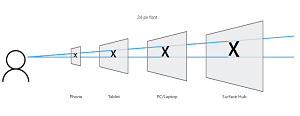 [Click on image for larger view.]
An Effective Pixel Size for Different Device Resolutions and Distances (source: Microsoft)
[Click on image for larger view.]
An Effective Pixel Size for Different Device Resolutions and Distances (source: Microsoft)
Yesterday's post delves into UWP and adaptive (or responsive) design to fit different screen sizes and form factors. Developers are presented with six visual design patterns for scaling apps: app tabs (pivot); feed reader app; ebook/ezine app; master-detail; lifestyle app; and utility app.
"Bringing a Windows Phone Silverlight app over to the Universal Windows Platform involves many design considerations that didn’t come up when initially building it," Microsoft said. "This post provides strategies for redesigning the most common Windows Phone app categories. Sometimes a little bit of resizing is all you need to get your phone app to look good on a desktop or larger device. Sometimes, when a common UI is simply not possible, it may require building distinct user experiences for different screen sizes."
The post provides more links to further explore topics such as the master-detail and pivot-and-tabs patterns, screen size considerations, moving from Windows Phone Silverlight to UWP and more.
About the Author
David Ramel is an editor and writer at Converge 360.