News
New Source Code Typeface Gets Finicky Devs All Worked Up
- By David Ramel
- September 1, 2015
Is the length of the tail on a lowercase "i" driving you crazy as you work with source code in your favorite IDE? Do you like your zeroes delineated from the letter "O" with a slash or a dot?
Of all the new tools coming out for developers to put in their kits, a typeface designed for use in IDEs would seem among the most unlikely.
But Hack, recently updated, and with a Web site gone live, is kicking up quite a commotion on development-related sites like Hacker News and Slashdot.
Then again, perhaps it's not surprising, given all the fuss simple tweaks to IDE interfaces can cause, such as putting menu items in all caps and changing color schemes.
Hack is an open source "typeface designed for source code." And, of course, it's "hack-able," allowing for customization by finicky coders. The typeface is further described as "workhorse for code," with "No frills. No gimmicks.
Hack is hand groomed and optically balanced to be your go-to code face."
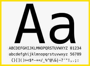 [Click on image for larger view.]
The Hack Typeface (source: Chris Simpins/Source Foundry)
[Click on image for larger view.]
The Hack Typeface (source: Chris Simpins/Source Foundry)
Designed by Chris Simpkins with the help of more than 20 contributors, the Hack project comprises four variations, monospace regular, gold, oblique and bold oblique, its site says. It supports multiple languages with 1,534 glyphs (characters or symbols).
In the spirit of open font communities such as libre, upon which the project is somewhat based, it's free to modify, free to distribute and free to use -- even commercially -- for print, desktop and Web projects.
The GitHub site explains:
The face has been re-designed with a larger glyph set, modifications of the original glyph shapes (including distinct point styles and semi-bold punctuation weight in the regular set to make analphabetic characters less transparent), and meticulous attention to metrics (including numerous spacing adjustments to improve the rhythm of the face and the legibility of code at small text sizes). The large x-height + wide aperture + low contrast design combined with PostScript hinting/hint replacement programs and a TrueType instruction set make it highly legible at commonly used source code text sizes with a sweet spot that runs in the 8px - 12px range on modern desktop and laptop monitors. Combine it with an HD monitor and you can comfortably work at 6 or 7px sizes.
That's a lot of detail about a typeface, but just how finicky coders can get about their environments is shown by 242 comments on the Hacker News post, where readers go into hundreds of typeface details, down to dissing the length of the tail on an "i."
"Nice font," said a reader with the handle andmarios. "I really appreciate that it supports non-Latin alphabets. Even though it seems that these alphabets come from the original font (DejaVu maybe?) and hasn't been much worked on, it still is extremely useful!"
As with most of the posts, that praise was backed up by a criticism: "The small i seems a bit funny to me," the post continued. "It is like a Greek iota (ι) with a dot on top. Also it is a bit tall font. Whilst that makes text/code more readable, on the same time it let you see less lines on your terminal. My main mono font (Liberation Mono), lets me see comfortably 51 lines in a full screen terminal on a 15.6" laptop. Hack font only shows 45 lines (11 percent less code :p) at an equally acceptable size."
On Slashdot, more than 200 comments included observations such as: "I would like this font a lot more if the zero had a slash through it instead of that ridiculous ellipse in the center," which generated nine replies.
Some of the other typefaces listed as favorites on the dev sites include: DejaVu sans mono, Glass Tty VT220, Cathode, Cool Retro Term, Menlo, Monaco, Source Code Pro, Consolas 65, Triplicate, Dina, Anonymous Pro, Fantasque Sans Mono, Terminus, Meslo LG, Droid Sans Mono, Office Code Pro, Tamsyn, Ubuntu Mono, Hasklig, Lucida Console and more ... many, many more.
About the Author
David Ramel is an editor and writer at Converge 360.