In-Depth
Analytic apps add new logic to dashboards
- By Wayne W. Eckerson
- January 1, 2005
 An analytic application is the end result of any data warehouse or business intelligence system. Although definitions vary, many professionals in this field would agree that an analytic application consists of a series of logically integrated, interactive reports, including dashboards or scorecards. Those reports enable a wide range of users to access, analyze, and act on integrated information in the context of the business processes and tasks that they manage in a given domain, such as sales, service, or operations.
Analytic development environments
The Data
Warehousing Institute (TDWI) calls the newest development technique for
building analytic applications an “analytic development environment, or
ADE,” which enables developers to drag and drop analytic components onto a
screen to rapidly create analytic applications. More than being a report
designer, an ADE gives developers precise control over an application’s
look, feel, functionality, and workflow.
|
The ADE is one of the issues we at TDWI explored in a fall 2004 survey of employees in nearly 500 organizations, most from corporate IT ranks.
An ADE is the analytic counterpart to the Integrated Development Environment, or IDE, in both functionality and name. Examples of today’s more popular IDEs are Microsoft Visual Studio.NET, Borland’s JBuilder and C# Builder, Eclipse, IBM’s WebSphere Studio, and BEA’s WebLogic Workshop.
A promising future
ADEs promise to accelerate the development of custom-built analytic applications, and make it easier and faster to customize packaged analytic applications. As such, ADEs will soon become the way for users to fulfill their desire to build and extend analytic applications. Starting with either a packaged analytic application or a BI tool, developers will be able to quickly customize the last 20 to 40 percent of the front end of an analytic application.
In fact, the drag-and-drop nature of the ADE will further shift development responsibilities from IT developers to power users in the field. This will, once and for all, get the IT staff out of the business of creating reports so they can focus on what they do best: building a robust data architecture and abstraction layer for end users.
The new ADE tools will also accelerate the trend toward rapid prototyping. Developers and power users can use an ADE tool in a joint application design session to get immediate feedback from users on application screens, metrics, and report designs. This iterative process will result in better designed applications, delivered and modified more rapidly.
Rapid prototyping, using ADEs, will soon become the
predominant method for building dashboards and scorecards. Already, many BI
vendors offer specialized ADEs for creating dashboards. (See 'Evaluation criteria for
dashboards' for a list of
criteria to evaluate vendor dashboard solutions.)
Using ADEs to build dashboards
Here’s a rundown of what dashboards are and why they’re popular:
Definition.
A dashboard or scorecard is a graphical display that compares performance against predefined goals. Most people use these two terms interchangeably, although there is a subtle difference. A dashboard records actual performance or behavior — like an automobile dashboard does — while a scorecard measures that performance against objectives or goals. In other words, a dashboard tells you how you are doing; a scorecard tells how well you’re doing. We will use the term dashboard to refer to both types of analysis.
Popularity
.
Dashboards are an increasingly popular type of analytic application today. Most of our survey respondents said their groups use dashboards as their primary analytic applications (31 percent), or have deployed one elsewhere (28 percent.) Another 24 percent are currently developing a dashboard or scorecard. Thus, almost three-quarters of the people who took our survey either have a dashboard or scorecard or are developing one.
Visual Exception Reporting
.
The reason for the growing popularity of the dashboard is that it provides an extremely intuitive interface to monitor and analyze data. It conforms to how the majority of users want to interact with information. They want to glance quickly at graphical, color-coded icons to determine if a process, project, or task is on target or not. If not, only then do they want to drill down into charts and tables to take a closer look at what’s going on.
Proactive Notification.
The best dashboards go one step further: If performance is above or below targets, they automatically notify the appropriate users to take a look, even sending them the data via e-mail or another channel the user prefers. In essence, dashboards are visual exception reports that filter through the morass of data and highlight only those elements that need immediate attention. When implemented with right-time data, dashboards enable users to work proactively and intelligently and not get bogged down collecting or analyzing data that has little immediate business value.
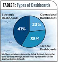
Types of Dashboards
.
There are three types of dashboards: strategic, tactical, and operational.
Strategic dashboards contain metrics linked to corporate strategy. These dashboards are cascaded to every level and group in the organization, each with a different version of corporate metrics tailored to its business domain. Strategic dashboards ensure that all parts of the organization march in lockstep toward a common goal. One way to implement a strategic dashboard is to use the Balanced Scorecard methodology David Norton and Robert Kaplan created.
Tactical dashboards, on the other hand, focus solely on measuring the performance of local groups and may or may not be tied to corporate strategy and objectives. For example, a tactical dashboard might be used to monitor the progress of a project or performance against goals established by a mid-level manager.
Operational dashboards are used to monitor business processes and activity as it happens so users can intervene to fix a problem or capitalize on an opportunity. Operational dashboards leverage right-time information — operational data collected and displayed as soon as it is gathered or within a timeframe deemed appropriate by operational specialists who oversee the process. For instance, a flight controller needs up-to-the-minute information about incoming and outgoing flights, while a truck dispatcher may only require hourly data to manage shipments efficiently.
How we’re using dashboards
When we asked survey respondents to identify the type of dashboard they support, 41 percent said they support a strategic dashboard, followed by 35 percent who maintain tactical dashboards and 23 percent for operational dashboards. (See Table 1.)
Scope.
The average number of dashboard users at these organizations is 320, although this number is skewed by a few organizations that have deployed dashboards to tens of thousands of users. Three-quarters of organizations that responded to the survey have fewer than 100 dashboard users. So, dashboards have a ways to go before they reach a substantial majority of users in most organizations.
At the same time, nearly half (48 percent) say the scope of their dashboard applications is enterprise in nature. Much smaller percentages say dashboards have a divisional scope (28 percent), departmental scope (16 percent), or inter-enterprise scope (7 percent.) In my experience, most companies implement dashboards for a functional area, such as finance or operations, but on an enterprise scale. In other words, everyone in the functional area throughout the company uses the dashboard.
|
Levels
.
We also discovered that organizations deploy four levels of dashboards throughout the enterprise. We did not ask whether these dashboards contain common metrics so that data can be rolled up from one level to another. However, it’s safe to assume that most organizations with multiple levels of dashboards have cascaded them to some degree.
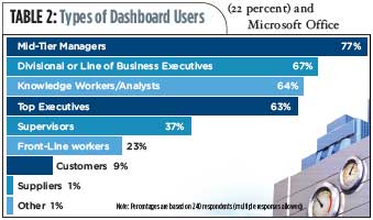 Users
.
The highest percentage of dashboard users are
mid-tier managers (77 percent.) I suspect they’re using tactical
scorecards to keep track of the processes, projects, and operations that
they oversee. Other key users are divisional executives (67 percent),
knowledge workers (64 percent) and top executives (63 percent). (See Table
2.)
|
Dashboard Tools
.
Most organizations created their dashboards from BI tools (41 percent), followed by custom code (22 percent) and Microsoft Office (13 percent.) Only 17 percent have purchased a packaged dashboard solution from a vendor. We expect this percentage to rise in the next few years as more vendors provide robust dashboards solutions.
Most dashboards support a range of functionality. In general, dashboards have three levels: they let users drill down from high-level graphical indicators (72 percent); to a table or chart that can be filtered to show different views of data (82 percent); to detailed transaction data (54 percent).
Advanced dashboard implementations make it easy for executives to add or modify metrics. However, the overwhelming majority of end users do not modify the dashboards, although one-third of organizations enlist power users to update dashboards. The IT and application development departments are the most likely candidates to update dashboards to reflect new requirements.
Tune into analytic app environments
Dashboards are quickly becoming the primary interface to business intelligence information because they conform to the way a majority of users wish to access, analyze, and act on information. While most dashboards are strategic in nature and enterprise in scale, the number and type of dashboard users IT supports indicates that most organizations are still in the early stages of dashboard deployments.
Judging from the results of our survey, more organizations can advance the deployment and use of dashboards by turning to the analytic development environment.
Discussion Points
Analytic Applications
• Analytic development environments, or ADEs, promise to accelerate
development of custom-built analytic applications, and make it easier and faster
to customize packaged apps.
• Rapid prototyping, using ADEs, will soon
become the predominant method for building dashboards and scorecards.
• The
highest percentage of dashboard users are mid-tier managers; division executives
and knowledge workers are also key users.
• While one-third of organizations
call on power users to update dashboards, IT professionals and application
developers are most likely the ones to update dashboards to reflect new
requirements.